8-Pixel Obsession: Crafting Typus Mono
Itch That Wouldn't Go Away#
Every obsessive engineering rabbit hole begins with an innocent, reasonable thought.
Mine was simply: I just want my text in GNU Emacs to look identical to my terminal.
If you read my previous post on Building a Modular Sanctuary, you know that I spend most of my working hours inside two environments: Ghostty and Emacs. In Ghostty, I had dialed in what I consider the sweet spot of monospace ergonomics: cell compression. By configuring adjust-cell-width = -1 and adjust-cell-height = 1 on JetBrains Mono at 12pt, the character grid tightened up into a dense, high-information layout. No wasted horizontal space, no visual drift. Just crisp and pure visuals.
Then I would switch over to graphical GNU Emacs and the difference was jarring.
In Emacs GUI, the exact same text felt... loose, as if the dense terminal grid had been casually stretched out.
The root of the problem is architectural. Modern GPU-accelerated terminal emulators can compress character cells on the fly, shifting X-coordinates before rasterizing them through custom shaders. Graphical Emacs, by design, does not do that. It faithfully honors the TrueType metrics baked into the font tables, allocating every single pixel of advance width the type designer defined. No dynamic cell squishing, no shader tricks.
If I wanted consistent, high-density typography across both environments, there was only one real solution:
Bake the compression directly into the font files themselves.
Seductive Lie of Font Hacking#
"How hard could it really be?" Famous last words.
Digital typography is a dark art where legacy specifications from the early nineties still wait to punish anyone who touches an OpenType table unprepared.
The first prototype looked terrible. The glyphs were indeed 8% narrower, but they appeared frail and skeletal. GPU terminal renderers naturally produce slightly more visual "mass" through custom gamma curves and subpixel blending. Emacs GUI, relying on standard Linux FreeType rasterization, rendered the condensed outlines noticeably washed out.
To compensate, I had to completely remap the weight hierarchy. In Typus Mono, Regular is actually generated from upstream SemiBold, SemiBold is forged from Bold, and Bold is extracted from ExtraBold. Only then did the characters carry the right physical weight on screen.
While restructuring the tables, I also addressed programming ligatures. I understand why some developers enjoy watching -> turn into an arrow or != collapse into a single glyph. Personally, I despise them. Code is code; a dash should remain a dash and an equals sign an equals sign. The build script stripped every calt, liga, and dlig lookup table from the OpenType GSUB registry.
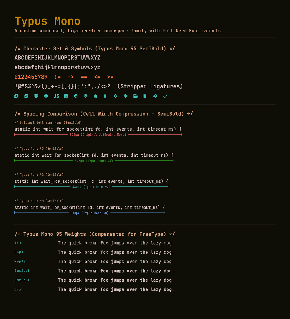
The result above speaks for itself: clean numerals, distinct operators, zero ligatures, and a tight 530-pixel horizontal footprint for 64 columns of text. At that point, it felt like the hard part was done.
And then I looked at the icons.
Nerd Fonts...#
If standard Latin typography is a disciplined grid, Nerd Fonts is an unconstrained carnival.
It packs over 10,000 disparate glyphs - distribution logos, Git graph nodes, file tree icons, terminal arrows, and legacy powerline dividers - into the Private Use Area of Unicode.
Applying a naive 8% horizontal scale across the entire patch set broke down immediately:
- Squished Logo Syndrome: Wide logos compressed into narrow silhouettes, while already slender icons turned into unreadable vertical lines.
- Levitating Glyphs: Standalone icons designed for full cell heights floated awkwardly 200 units above the text baseline, hovering near the ceiling while adjacent text sat on the floor.
- Fedora Hole Massacre: TrueType outlines depend on Non-Zero Winding rules. If an outer contour runs clockwise, any inner cutout (like the transparent center of the Fedora logo or the loops of a
%sign) must run counter-clockwise. An early winding algorithm I tested incorrectly treated every secondary contour as a cutout. The bottom loop of my percent signs and the middle of the Fedora icon collapsed into solid, pitch-black blobs.
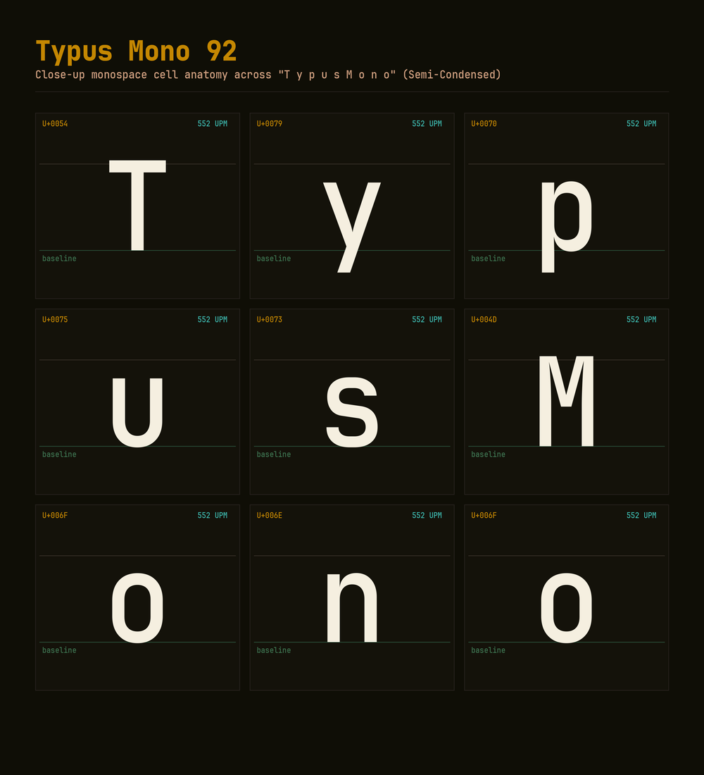
Resolving this required formalizing a dedicated layout pipeline (Approach A):
- Baseline Anchoring: Every standalone icon is mathematically anchored to the font baseline (
Y = 0). - The Cap-Height Ceiling: Tall icons are proportionally clamped to a maximum height of
700 UPM(matching the ascender line of capital letters). - 1:1 Proportional Geometry: No artificial horizontal distortion. When an icon scales down in height, its width scales by the exact same ratio.
- Untouched Powerline Dividers: Full-height powerline glyphs and box-drawing elements remain unscaled.
Monospace Sanctuary#
Polishing Typus Mono took dozens of automated build iterations, side-by-side rendering tests, FreeType hinting adjustments, and tuning the OpenType usWidthClass metadata so fontconfig would correctly group the family rather than splintering it.
Was it worth spending nights writing a custom compiler for a monospace font?
Absolutely. I'd gladly do that again and recommend it to anyone who - just like me - likes everything done their own way.
There is a quiet satisfaction in opening an editor buffer where every character cell behaves predictably down to the pixel, where statusline icons align perfectly with the text, and where your terminal and your editor share the exact same visual weight. And I'm chasing that Zen zone every single day.
If you share the same stubborn typographic preferences, the entire family (with 90%, 92%, and 95% width variants across 12 weights) is open source: szymonwilczek/typus-fonts.
As always:
Signed-off-by: Szymon Wilczek <[email protected]>